Category Archives: Design

Why do we need design?

A joke I’ve often heard before is about engineers and their inability to actually design apps. The gist is that the engineers have large amounts of creativity and technical expertise and can create amazing devices, but the actual interface is designed terribly. Now, obviously this isn’t the case in real life: engineers are just as good as the general population in general interface design properties, if not better.  The problem is that, to make a good interface, one needs to put in some serious research and effort. I learned from a human factors class that, when you design something, you want it to be so good that your consumers don’t realize that there could be any other design.

engineer design

One important factor to note is that the device in which the interface is used on is extremely important to understanding the design. Earlier in the year, my design team tossed around ideas about some sort of web app or website, so I looked around a little on the internet and learned about WIMPs

But not that kind of wimp. WIMP http://en.wikipedia.org/wiki/WIMP_(computing) is a term in human-computer interaction which stands for “windows, icons, menus, pointer.”  These are elements that are—or were—supposed to be used in user interfaces, and have been in place for a few decades now. WIMP interfaces have:

  • Window: a usually rectangular area which runs a self-contained program or application.
  • Icon: A symbol used as a shortcut that represents and execute an action or run an application
  • Menu: A list or sets of lists that allow a user to select and execute programs and tasks, and are often in “pull-down menu” format.
  • Pointer: an onscreen navigation symbol that allows a user to select things.

All these seem very basic right? You’re probably reading this post on a computer that uses these elements as part of the UI, on an internet browser that also uses a WIMP-style GUI (Graphical User Interface). In fact, but a decade ago, this was the dominant form of UI design. As I mentioned before, the thought was generally “Well of course you design an interface that way. How else could you design it?!” Later, we got the iPod, which was one of the major players in moving away from this system due to the lack of true windows (the iPod used different screens instead of discrete windows), icons (text was used), and pointer (no actual pointer, but the blue “select” option served the same purpose). Now, we have interfaces that no longer require WIMP-style interfaces: touchscreen devices, augmented or virtual reality systems, and voice or gesture based systems. They are considered post-WIMP interfaces and rely on different types of design elements.

I’m going to come back to this topic: I find it useful for anybody that wants to design a product or companion for some kind of service. For now, though, I just want to leave with this: the design elements of a device must be considered carefully. Not only do computers have different design strategies than mobile devices, but the design strategies will differ between iOS, Android, and Windows apps. With this in mind a little research on design will prove fruitful.

Engineering Conferences

“Healthbook” App for iOS 8

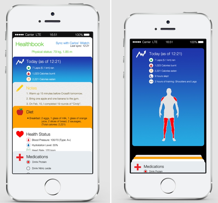
According to rumors, the newest version of the Apple OS system, iOS 8, will include an Apple-designed app called “Healthbook” that will be a “preinstalled app that can track data points including a user’s blood pressure, hydration, heart rate and potentially other statistics like glucose levels. It could also remind users to take medications at certain times during the day.” According to the description and concept art, Healthbook intends to be an all-in-one resource for all kinds of self-tracking, including dietary monitoring, fitness, filling prescription. It is not clear whether it intends to self-diagnose any diseases.

Concept images for the “Healthbook” iOS App, courtesy of MacRumors

iOS 8 is expected to be announced at Apple’s annual World Wide Developers Conference in June 2014. This means that Healthbook could become available as early as this fall. It is also predicted that the Healthbook App will also be integrated with the upcoming iWatch.

What will having a preinstalled application on such an widely accessible device like the iPhone mean for the healthcare movement, especially self-trackers? Although the app stores contains hundreds of thousands of health-related applications, will having an official Apple-designed healthcare mobile application increase a user’s proclivity to become an e-patient, self-tracker, or  be more aware of their health?  How will Healthbook take into consideration the major issues regarding self-tracking applications such as privacy and user control?

And what about Apple’s design strategy? What features or GUI aspects will differentiate it from other self-tracking applications in the App Store and on Android? Reports claim it will use a similar card-based design strategy similar to Passbook, another Apple-developed application that keeps all your forms of payment, such as credit cards, in one place and was meant to serve as a virtual wallet of sorts. Will having all your health data in one place be seen as efficient and beneficial, or dangerous in regards to privacy?

My guess? Healthbook will receive a lot of early hype and attention, especially as the release of iOS 8 draws closer, and upon official release many curious users and e-patients galore will use the application in its early stages. However, unless Healthbook provides some sort of dynamic, engaging experience beyond being a basic self-tracker application, users who are were not originally intrinsically motivated to monitor their health will become bored by it and eventually stop using it. As we have learned, most self-trackers are not those who are in need of medical attention, but those who already have an interest in maintaining their health, and unless Apple brings something new to the table with Healthbook, the average user will see Healthbook not as a life-saving tool, but a new toy or game, and will quickly become bored once it loses its novelty.

Here’s two suggestions for how Apple can distinguish Healthbook from its competitors and engage the interests of users who have not had previous interest in self-tracking their health lifestyles:

  • For the dietary/calorie tracker, add fun facts to inform and put their diet into perspective. For example, if after a run a user burns 200 calories, Healthbook can joke “You just burned off a bag of chips”. 
  • Have a goal-setting feature that includes specific suggestions on how to achieve that goal. For example, if a user wanted to lose 10 pounds, Healthbook could not only suggest how many miles they should run a week, but also suggest dietary restrictions and specific workout routines the user can engage in to create a total body regime that will help reach the user’s goal.

Whether these features or something even better (as Apple’s forte is coming up with what the user needs before they even need it) will be included in the Healthbook application remains to be seen. I am personally very glad Apple is trying to create an accessible and beneficial device that could provide better awareness of personal health. Apple has reinvented the personal computer, music, cellphone, and tablet industries, and I hope it can achieve the same success in revolutionizing the mobile healthcare space.

Room to Create

This semester, as we’ve investigated strategies to improve inter-professional communication and care coordination in intensive care unit (ICU) rounds, I’ve been surprised by two things:

  1. Everyone’s seen the problem. This isn’t a situation where astute perception revealed systemic undercurrents; anyone who’s participated in rounds is intimately familiar with its inefficiencies. Everyone understands this, but nobody has definitively addressed it.
  2. Everyone’s thought about solutions. Whenever we’ve discussed rounds with a patient or provider, it’s profound how much they’ve given this thought. Anyone can readily suggest areas for impact, or even specific methods for improvement. Why hasn’t intuition translated to innovation?

It’s attention – or more specifically, the scarcity of it. Nobody recognizes the opportunities for creative destruction in healthcare better than the people who spend each day in the trenches of clinical medicine. But after patient care, administrative hurdles, research responsibilities, teaching duties, continuing education, and something that might resemble a personal life, providers have neither the interest nor the capacity to cultivate an innovative spirit.

Which leads me to ask: what might healthcare look like if we gave providers the time and space for disruptive thinking?

What if medical teams borrowed from Dropbox’s Hack Week? What if health institutions, as Google did, allowed every provider 20% of their time for creative ventures? What might the likes of the inventive energies and constructive cultures that created GMail, AdSense, and Google News do for healthcare? A different approach to ICU rounds? A re-designed EMR interface? A stronger capacity to screen for, and address, the social determinants of poor health? The opportunities are limitless.

And thus, for healthcare providers, students, patients, entrepreneurs, everyone, I offer these thoughts:

  1. What would you do if 20% of your professional time was protected for creativity and inspiration?
  2. In what ways does your work atmosphere cultivate innovative vision, and how could it better meet that goal?
  3. Beyond limits to time and attention, what are other functional obstacles to innovation in health settings, and how can we mitigate them?

The far-reaching effects of clinical trial conversations

When I was first diagnosed with Hodgkin’s Lymphoma, my oncologist sat down with me to discuss treatment options.

There were two options for standard of care, she told me. I could get six cycles of chemotherapy, or four cycles of chemotherapy followed by radiation. I could also enroll in a late-phase clinical trial, which was testing the long-term results of rituximab biotherapy on Hodgkin’s patients with cancer cells that fit a certain profile.

Rituximab had already been approved for other lymphomas, and a published study showed improved results when this biotherapy was combined with chemotherapy. It also was fairly risk-free. Although various adverse effects do occur with rituximab, the most common is an allergic reaction, which they give Benadryl for during treatment.

I decided not go on this clinical trial because of concerns about the control group. However, rituximab intrigued me. I found the previous studies convincing, even though the prices for the drug were astronomical – more than $6,000 per dose, and I would need more than one dose. So I called up my insurance company, and they agreed to review my case.

They ended up paying for my treatment with rituximab, which makes good business sense. If I don’t relapse, my insurance doesn’t have to pay for the hassle. However, this is the key point: I would have never known about a vital drug if my oncologist had not mentioned a clinical trial. 

What else can we learn from my anecdote?

  • Conversations about clinical trials indicate a high quality of care. My oncologist gave me several options, one of which represented the cutting edge of cancer research.
  • Patient education and engagement matters. I had to be my own advocate to the insurance company, and it was precisely because I was educated and pushed that I was able to get the best treatment possible.


The Forgotten Strategy – How to Create More E-Patients

A lot of the discussion that we have in class is based around e-patients. In fact, one of the groups even has the direct problem of figuring out how to create more e-patients. So I find that I spend a lot of time thinking about this subject.

During this process, I seem to have come to the conclusion that a majority of the work surrounding e-patients has been directed at the patient end of the doctor patient spectrum. That makes sense right? We want “engaged” patients so we focus on giving these patients the access they need to knowledge and resources to understand and improve their health. So when we look to “create” more e-patients we focus on the patients. Sounds reasonable.

But we’ve become so focused on the patient that I can’t help feeling like there is a strategy we’re overlooking.

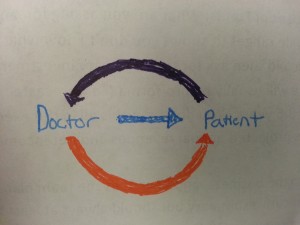
The picture below is of a model of patient-doctor communication that we looked at in class. When we look at creating e-patients we think of starting at the purple arrow: where engaged patients engage their doctors who then reciprocate.

20140311_115837

But what if we started at the orange arrow?

I think there is probably a large proportion of patients that are very accustomed to the traditional model of patient-doctor communication. Why don’t we use that to our advantage? If doctors used their influence to encourage patients to start doing some of the activities associated with e-patients and gave them the resources, patients may be more motivated and feel more comfortable becoming e-patients.

 All doctors have to do is get a patient started; once that happens, I think the nature of the e-patient community will automatically encourage a patient to take more responsibility for their health.

That’s why think there needs to be a segment of the e-patient movement that is focused primarily on convincing doctors to encourage their patients; a group focused on teaching doctors the value of e-patients.

Maybe that already exists. Or maybe I’m wrong. Maybe this is too controversial. I know e-patients sometimes pride themselves of being autonomous and not needing a doctor to tell them what to do.

But if this can help us create more e-patients, isn’t that a goal we all share? It’s definitely something worth thinking about.

Follow

Get every new post delivered to your Inbox

Join other followers: