Look Pretty, Work Pretty

There are countless resources and reputable medical journals out there in the world that would provide patients with everything they need – information from how to tackle the seasonal flu to managing side effects after being injected with ketamine for surgery. There are countless brochures, booklets, and instruction manuals that guide patients through critical information at any point during a treatment process.

But – the problem is, these don’t get read. It is the standard “tl;dr” – too long, didn’t read – phenomenon.

Health literacy is apart of the issue, but the visual impact of the message is critical as well. After 15 weeks of using research and feedback for creating an ePatient intervention in the Medial Media Arts Lab – it has come to be blatantly obvious that design can be what makes or breaks a product. Sometimes, visual attractiveness will win over efficiency.

Looking through different infographics and flowcharts about the healthcare system, I came to stumble upon the Robert Wood Johnson Foundation’s Visualizing Health project. This project attempts to help healthcare providers chose the best method for displaying health statistics in a manner that will be easy for the health consumer to understand.

Their main gallery tool – Wizard – displays a whole database of images that you can choose from depending on what type of information you are trying to convey. You can select from a wide variety of images and read information about what specific factors made that particular image powerful, and how successful it was in conveying the information it set out to address.

Here are a couple examples:

This website is a great resource for students and professionals alike, and can very well be applied to areas outside of health and patient care.

Communication is key to any service job, and especially to medicine because sometimes healthcare providers and their consumers just seem to speak two different languages. To play the cliché – a picture is worth a thousand words – the right picture in the right scenario just might be the intervention we need to push patients to be a little more engaged, educated, and involved in their treatment.

Passive medicine is easy to find, but through resources like these and new technologies incorporating the patient more into healthcare decisions, we are slowly but surely overriding this attitude. If patients feel more confident in the way they are able to accept and understand information, they should feel more confident walking into the physician’s office and conveying their opinions about clinical treatment. Passivity is the first thing to break when trying to bring about new engagement in patients, and if pictures are the answer – then let’s get drawing!

Trust the Knife

Last summer my father had a basal cell carcinoma removed. It was about a dime sized patch of skin just to the left of his nose. Although this form of cancer is rarely deadly it was still a sobering experience for my family especially considering we are all fair skinned and highly susceptible to skin cancer. Living in southern California does not help either. The surgery was successful and after one year and several cortisone shots one can barely tell my dad had a chunk of flesh taken out of his face.

My dad did however have one problem with his treatment process. It wasn’t the hospital facilities or the painful tending to his wound every night after the surgery. Instead his biggest issue with the whole experience was that his doctor rarely talked during checkups. During the whole process I remember him constantly bringing up how the doctor would come in the room, examine him and then most often leave without uttering a single word. When my dad tried to ask him how everything is going he would nod and mutter inaudibly under his breath. The only words the doctor ever said to my dad involved what he was going to do and that my dad had to make another appointment with his secretary. The nurse was responsible for informing him why they were doing surgery and providing background information on this form of cancer. My dad was really turned off by his doctor’s lack of enthusiasm and transparency. I was shocked that a doctor, whose job it is to form a bond with his or her patient and instill trust, would not share information face to face and instead use nurses convey reasoning for the treatment.

26chen_600a

To me this kind of doctor seems to be of the old school type, those who believe you do what I say and everything will be okay. While many younger doctors focus on good bedside manner there remain many that practice old-fashioned principles. Granted my dad’s doctor is in his late seventies so he is most likely the byproduct of this archaic brand of practicing medicine. Nonetheless, this example draws attention to the necessity of doctor-patient communication. It is important not only that communication take place regularly but that the patient feels he or she is on a level playing field and can speak freely. The best way to ensure patient involvement is for the doctor to speak more often, using language that the patient can understand while having a pleasant and familiar tone. In this class we have learned a lot about how technology can enhance communication but it is vital we do not forget that quality care involves personal conversation that creates an atmosphere conducive to establishing trust.

Sleep Profile Followup

The sleep profile quiz, if you’re interested!

http://www.bbc.co.uk/science/humanbody/sleep/profiler/


Resurrecting PowerPoint in Medical Education

I recently visited one of my teachers from high school and was greatly amused to see her teaching class from an archaic overhead projector.  I did not understand why, in a world with so much innovative technology, she had opted to use such outdated equipment. The experience caused me to ponder the extent to which technology has become integrated in our culture, and how this has affected the increasing role of multimedia software in education.

pvsp

Tools like PowerPoint, podcasts, video tutorials, etc., offer new and innovative teaching methods and possibilities. As a result, these technologies are used so frequently that it has become almost more unusual for a professor NOT to use some sort of multimedia tool in conjunction with their lecture. PowerPoint, especially, has become a popular multimedia resource for professors because of its ease of access and ability to streamline information into bullet-pointed lists.

While the software offers a variety of options for presenting and configuring information in many different ways, most professors still opt for the classic bullet-point format. We have all had that professor who lectures quickly, flipping through plain slides overloaded with text, resulting in a mad rush to record the information. Ultimately, this leads to confusion and the propagating of washed-out expressions and bored students.  Sadly this detrimental practice is so common that researchers have named the phenomenon, “death by PowerPoint.”

badpowerpointnews1

If this is the case, then how is the use of PowerPoint as an educational tool any better than my teacher’s antiquated, boring overhead projector?

Medical education provides an extremely high stress environment where students must learn enormous amounts of information in a limited amount of time. In such a high-stake atmosphere, improvements in the effectiveness of educational tools like PowerPoint could have a massive effect on the education of our country’s upcoming physicians.

So, are there ways to improve the use of PowerPoint and other multimedia tools to make them better resources for imparting information to students?

Fig2

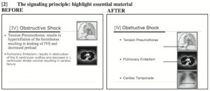
Example of Adapted Powerpoint Slide

Research done by Richard E. Mayer has directly addressed many of these questions. Mayer has established a number of theories and principles regarding design and implementation strategies of multimedia educational materials through his work with evidence-based education materials. Both his and supporting research has shown that incorporation of Mayer’s multimedia design strategies involving college-level students showed increases in short-term retention of information. In addition, current research has shown that incorporation multimedia (similar to Mayer’s design) led to an increase in the short-term retention of information by medical students.

Preliminary evidence has shown that PowerPoint and its use can be redeemed, but still leaves many questions unanswered:

(1) Is there a possibility of improving multimedia presentation to improve long-term information retention?

(2) Do the use of multimedia tools improve student’s ability to incorporate information into a clinical setting?


Sources:

Mayer, R. Multimedia Learning, 2nd edn. Cambridge: Cambridge University Press 2009.

Tagged

The Risk That Comes With Too Many Choices

It’s hard to believe that there were no health apps over a decade ago and now new apps are being created everyday, with thousands being created every year. When researching diabetes-tracking applications for our project, I searched diabetes in the iTunes App store and I was given 968 results. When faced with so many choices, we often become overwhelmed and don’t make smart decisions. Barry Schwartz, author of the “Paradox of Choice” summarizes the risk that comes with too many choices by saying:

            “When people have no choice, life is almost unbearable. As the number of available choices increases…the autonomy, control, and liberation this variety brings are powerful and positive. But as the number of choices keeps growing, negative aspects of having a multitude of options begin to appear. As the number of choices grows further, the negatives escalate until we become overloaded. At this point, choice no longer liberates, but debilitates.”

choices

source: trulyheal.com 


When making a decision on which app to download, we end up relying on information given to us on app reviews or by the price of the app and while this information is useful, it can often be misleading. While an app might be expensive, it perhaps would better suit the users needs than the free app. And while one app works for someone else, every patient has different treatment plans and goals. In the worst scenario, the user becomes so overwhelmed that they don’t end up downloading an app at all. Here are some tips for making a informed decision when choosing an app:

  • Ask your doctor- Although not all physicians will know of useful applications, a physician that is familiar with treating patients with diabetes will probably have heard positive reviews of certain apps. Also, since your physician is familiar with your treatment plan, they will be better able to recommend an app suited to you then some random guest review on iTunes. Also, as the use of health apps becomes more common, physicians are becoming more aware of the variety of apps out there. One diabetes treatment app (BlueStar) even requires a prescription from your doctor!
  • Don’t solely focus on price- While it is often our natural inclination to download the free app, the one that costs $1.99 might be ten times better. This isn’t to say that price is correlated with quality of app, just try to focus on the features of the app instead of the price (as long as the price is reasonable).
  • Focus on the features most important to you- We can be tempted to download an app that offers the most features, but this type of app is often hard to navigate and confusing. Depending on your condition, choose the top three features you want in an app. For example, some diabetes patients want an extensive nutrition tracking feature while others are not interested in this feature. Once you narrow down your priority features, choosing an app will become easier.

Even though making a choice may be difficult, most of the health apps on the market will enable you to take better control of your health and will end up making it easier to manage your condition.

Follow

Get every new post delivered to your Inbox

Join other followers: