Erasing Luck From the Equation


Over the last month, Team SAVE has conducted interviews with patients who have participated in or are currently participating in clinical trials. In each interview, we asked the patient about their experiences, opinions, and suggestions. While conducting these interviews, we noticed a common thread among what many of the patients said; in almost every interview that we have conducted thus far, the interviewee has said something along the lines of:

          “I am only alive today because of pure chance and luck”

In most of the situations, the interviewee had been in a late stage of cancer, and by chance had stumbled upon a clinical trial that miraculously reversed their condition. In one case it was a faint suggestion online that had caused them to seek out the trial. In another it was a lucky reference from a doctor who recommended another doctor who just so happened to be studying the exact mutation of the patient. In these cases, the patient somehow managed to find a suitable trial, when the odds of finding one were close to none.

Luck should be erased from the equation of clinical trials. In other words, the recommendation that the doctor gave to visit a specialist for some disorder or the advice given on a website should not happen by chance. In an ideal setting, the right information about trials should always naturally travel to the patient. To remedy this situation, we have been designing the role of a clinical trials navigator, who will consistently provide education about trials, help patients obtain trials information. The navigator will be the person that the patient sees soon after diagnosis, and during the meeting with the navigator, the patient will be brought up to speed about clinical trials, and relevant trials will be suggested by the navigator. We hope that this will remove the chance required for patients with specific mutations who need cutting edge medicine.

Although most of the interviewees shared a similar story, some did not. One, in particular, had a completely opposite story. After being diagnosed with cancer, they immediately searched online for a possible mutations, and came to their doctor prepared with clinical trials in mind. It would be ideal if every patient acted like this, but unfortunately not every patient is so equipped. Going forth we are looking to design our solution in a way that engages not just the patients who would seek out help by themselves, but those who would not seek out aid, and are really the ones who need help the most.

Image Source: http://farm8.staticflickr.com/7221/7175331883_80d3ebae45_b.jpg

Mindful mHealth

In the past several years, there has been increased discussion about bringing medicine into the technological era, and out of the darkness of paper methods and inefficiency. Words and phrases like “media,” “digital,” and “mobile technologies”are becoming more and more linked to healthcare. Because we do live in the age of technology, a time when nearly every person in America owns a cell phone (91%) and uses the internet, such a movement seems not only favorable, but necessary. As we push medicine into the digital age, we applaud new, innovative uses of advanced technology for testing, treating, and tracking—for features that allow the new age of “ePatients” to take control of their health.

One of the most “fashionable” new technologies is the mobile app. Apps allow patients to use their mobile phones to track their diet, exercise, blood pressure, etc. With so many emerging uses, smartphones provide a promising avenue to increased ePatient activity. As a result, when people think of patient-centered health media, the first thing that comes to mind is generally mobile apps—or is it?

When I say “people,” this is a very biased demographic. I am a Rice University student in a Medical Media Arts class. While my peers come from very diverse backgrounds, our current lifestyle places us in a specific demographic—that of educated young people who are exposed to mobile technology, specifically smartphones, on a daily basis. Those developing mobile health technologies generally come from similar backgrounds, in that they are most likely very familiar with smartphone usage, and quite possibly own smartphones themselves. For a significant portion of the population, this is not the case.

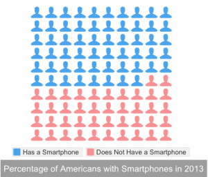
According to Pew Research, only 58% of Americans own a smartphone. While this is more than half of the population, this still means that roughly 131.8 million Americans (42%) do not own a smartphone or have access to mobile applications.

Screen Shot 2014-04-06 at 2.07.56 PM

One of the many advantages of mobile technology is its ubiquitous nature and its potential to bridge health disparities by reaching large, diverse populations. However, if all of our focus is placed in a sector of mHealth that such a significant portion of people do not have access to, we are only compounding health disparities with a technological one.

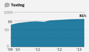
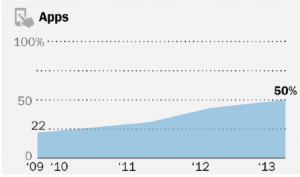
While I believe that mobile applications are a very promising avenue of healthcare, I think that other mobile phone capabilities should continue to be utilized. For example, while only 50% of cell phone owners download mobile apps, 81% send and receive text messages. Text messaging is a simple, low-cost technology, which can be utilized with or without a smartphone, and has consistently been in greater use than mobile apps.

Screen Shot 2014-04-06 at 11.40.53 AM Screen Shot 2014-04-06 at 11.41.13 AM

While text message-use is beginning to level-out, mobile app usage is still increasing. However, until the transferral to mobile apps is complete, the “non-app” population should not be ignored. Text message-based mHealth campaigns have already been developed, such as Txt4health, SmokefreeTXT, and text4baby. All of these services promote positive health behaviors by sending text message reminders to patients in the program. We should use these programs as models while we consider avenues that promote patient-centered healthcare and patient engagement, and be mindful of who we are trying to reach and how to best reach them. While mobile applications are a promising platform, which should definitely be utilized, we also have to ensure that we make mobile technologies the solution and not the problem in addressing health disparities.

Why do we need design?

A joke I’ve often heard before is about engineers and their inability to actually design apps. The gist is that the engineers have large amounts of creativity and technical expertise and can create amazing devices, but the actual interface is designed terribly. Now, obviously this isn’t the case in real life: engineers are just as good as the general population in general interface design properties, if not better.  The problem is that, to make a good interface, one needs to put in some serious research and effort. I learned from a human factors class that, when you design something, you want it to be so good that your consumers don’t realize that there could be any other design.

engineer design

One important factor to note is that the device in which the interface is used on is extremely important to understanding the design. Earlier in the year, my design team tossed around ideas about some sort of web app or website, so I looked around a little on the internet and learned about WIMPs

But not that kind of wimp. WIMP http://en.wikipedia.org/wiki/WIMP_(computing) is a term in human-computer interaction which stands for “windows, icons, menus, pointer.”  These are elements that are—or were—supposed to be used in user interfaces, and have been in place for a few decades now. WIMP interfaces have:

  • Window: a usually rectangular area which runs a self-contained program or application.
  • Icon: A symbol used as a shortcut that represents and execute an action or run an application
  • Menu: A list or sets of lists that allow a user to select and execute programs and tasks, and are often in “pull-down menu” format.
  • Pointer: an onscreen navigation symbol that allows a user to select things.

All these seem very basic right? You’re probably reading this post on a computer that uses these elements as part of the UI, on an internet browser that also uses a WIMP-style GUI (Graphical User Interface). In fact, but a decade ago, this was the dominant form of UI design. As I mentioned before, the thought was generally “Well of course you design an interface that way. How else could you design it?!” Later, we got the iPod, which was one of the major players in moving away from this system due to the lack of true windows (the iPod used different screens instead of discrete windows), icons (text was used), and pointer (no actual pointer, but the blue “select” option served the same purpose). Now, we have interfaces that no longer require WIMP-style interfaces: touchscreen devices, augmented or virtual reality systems, and voice or gesture based systems. They are considered post-WIMP interfaces and rely on different types of design elements.

I’m going to come back to this topic: I find it useful for anybody that wants to design a product or companion for some kind of service. For now, though, I just want to leave with this: the design elements of a device must be considered carefully. Not only do computers have different design strategies than mobile devices, but the design strategies will differ between iOS, Android, and Windows apps. With this in mind a little research on design will prove fruitful.

Engineering Conferences

Medical Data Fingerprints

Cancer and cancer treatment leaves a trail of digital data. I’ve been thinking about this digital trail today, and the different forms it took for me during my diagnosis and chemotherapy.

MyMDAnderson

mymdanderson

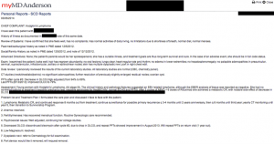
Patient Report on myMDAnderson

This is my personal MD Anderson portal. Though I never bothered to check on my documents very often, they are are available online, like pictures in a scrapbook. Looking back on them now, I’m intrigued by sheer the volume of the data MD Anderson collects on me. There are patient reports for every meeting and consultation, notes on every interaction.

During my first echocardiogram, the technician applied gel on my chest and asked an innocent question: “so, you’re an Ecology and Evolutionary Biology major?” I was instantly taken aback. I had never seen the man in my life or mentioned my major. But everything I told my oncologist had been stored for future reference, even the information I considered mundane. I often think about this interaction when we talk about how doctor-patient interactions should improve. The question about my major was unsettling to me rather than indicative of warmth and caring. It implied a greater, almost sinister, system of knowledge that I had not considered before then. Though the question was intended to be intimate, it “revealed the trick” and made the interaction seem alien and forced.

Texts

barium

Cellphone picture taken while prepping for a CT scan.

I sent many messages, both in text and photograph form,  in the earlier stages of diagnosis. They weren’t really to alert my friends and family to my progress, and they weren’t really to stave off anticipation and fear with regards to treatment, at least not consciously. I just had an obsessive desire to share the new events and experiences that were occasionally humorous, as in the case of the apple-flavored barium swallow, or the nurse who assured me that the radioactive glucose used during PET scans was “just a bit of sugar water, like they give to hummingbirds.” It turned out  that image texts were the most immediate and easy way for me to convey information, and what I usually used. The trail of texts did die off towards the end of my treatment, however. I was tired. I felt I had less to say. This is in line with what I’ve heard from many current and former patients: when you’re feeling sick, you don’t want to interact with technology and others.

Google Searches

This one is less obvious, but still there and very important. I was constantly researching my diagnosis, symptoms, side effects of chemo and biotherapy. These will influence my future search results in ways I may not necessarily anticipate now.

Many communication problems in medicine require tailoring the solution to the individual patients. Some may want warm and caring doctors, others want their physicians clinical and direct. Some may engage eagerly with apps, while others have trouble mustering the motivation to get out of bed. These sorts of digital trails provide several unique perspectives: the medical and physiological angle, the relationship angle, the personal and introspective angle. How can we harness and combine these perspectives to create better solutions? And how can we respect privacy and patient concerns while we do so?

“Healthbook” App for iOS 8

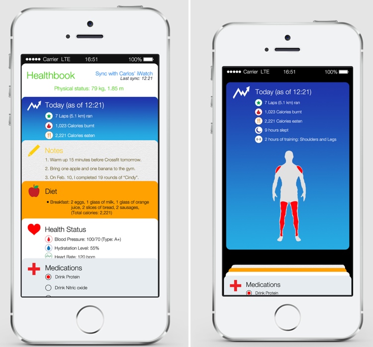
According to rumors, the newest version of the Apple OS system, iOS 8, will include an Apple-designed app called “Healthbook” that will be a “preinstalled app that can track data points including a user’s blood pressure, hydration, heart rate and potentially other statistics like glucose levels. It could also remind users to take medications at certain times during the day.” According to the description and concept art, Healthbook intends to be an all-in-one resource for all kinds of self-tracking, including dietary monitoring, fitness, filling prescription. It is not clear whether it intends to self-diagnose any diseases.

Concept images for the “Healthbook” iOS App, courtesy of MacRumors

iOS 8 is expected to be announced at Apple’s annual World Wide Developers Conference in June 2014. This means that Healthbook could become available as early as this fall. It is also predicted that the Healthbook App will also be integrated with the upcoming iWatch.

What will having a preinstalled application on such an widely accessible device like the iPhone mean for the healthcare movement, especially self-trackers? Although the app stores contains hundreds of thousands of health-related applications, will having an official Apple-designed healthcare mobile application increase a user’s proclivity to become an e-patient, self-tracker, or  be more aware of their health?  How will Healthbook take into consideration the major issues regarding self-tracking applications such as privacy and user control?

And what about Apple’s design strategy? What features or GUI aspects will differentiate it from other self-tracking applications in the App Store and on Android? Reports claim it will use a similar card-based design strategy similar to Passbook, another Apple-developed application that keeps all your forms of payment, such as credit cards, in one place and was meant to serve as a virtual wallet of sorts. Will having all your health data in one place be seen as efficient and beneficial, or dangerous in regards to privacy?

My guess? Healthbook will receive a lot of early hype and attention, especially as the release of iOS 8 draws closer, and upon official release many curious users and e-patients galore will use the application in its early stages. However, unless Healthbook provides some sort of dynamic, engaging experience beyond being a basic self-tracker application, users who are were not originally intrinsically motivated to monitor their health will become bored by it and eventually stop using it. As we have learned, most self-trackers are not those who are in need of medical attention, but those who already have an interest in maintaining their health, and unless Apple brings something new to the table with Healthbook, the average user will see Healthbook not as a life-saving tool, but a new toy or game, and will quickly become bored once it loses its novelty.

Here’s two suggestions for how Apple can distinguish Healthbook from its competitors and engage the interests of users who have not had previous interest in self-tracking their health lifestyles:

  • For the dietary/calorie tracker, add fun facts to inform and put their diet into perspective. For example, if after a run a user burns 200 calories, Healthbook can joke “You just burned off a bag of chips”. 
  • Have a goal-setting feature that includes specific suggestions on how to achieve that goal. For example, if a user wanted to lose 10 pounds, Healthbook could not only suggest how many miles they should run a week, but also suggest dietary restrictions and specific workout routines the user can engage in to create a total body regime that will help reach the user’s goal.

Whether these features or something even better (as Apple’s forte is coming up with what the user needs before they even need it) will be included in the Healthbook application remains to be seen. I am personally very glad Apple is trying to create an accessible and beneficial device that could provide better awareness of personal health. Apple has reinvented the personal computer, music, cellphone, and tablet industries, and I hope it can achieve the same success in revolutionizing the mobile healthcare space.

Follow

Get every new post delivered to your Inbox

Join other followers: